TL;DR
Independent of the fact that stonks usually go up, equal-vesting, four-year RSU grants are worth ~26% more than their face value due to the embedded optionality and ~13% more than the equivalent one-year grant. I leave figuring out the option value of Google’s front-loaded vesting schedule as an exercise for the reader.

What motivated this post?
A friend just took a recruiting call for Reddit. They explained how they offered one-year RSU grants to protect employees from the vagaries of the market. And despite sneaking my critique of Google’s RSU compensation philosophy into the very end of my previous post on deciding between Google and Meta PM offers, it triggered quite a bit of discussion (including a response from a Google spokesperson!).
This recruiting call got me thinking about RSU compensation in general and reminded me that a few years ago, Coinbase, Stripe, Lyft, Walmart, Reddit, and others switched from offering the quasi-industry standard 4-year RSU grant to single-year grants. For those of you who aren’t intimately familiar with big-tech compensation, this means that they transitioned from issuing a block of stock priced at the hiring date that vested over four years to a block of stock one-quarter the size priced at the hiring date that vested over a single year.
Their motivation was that one-year grants are more “employee friendly” because they recover compensation if stock price falls. For example, if you joined Meta in the fall of 2021 as many did as the company was rapidly expanding, your 4-year RSU grant would be calculated using a $375 share price. By the following year, the stock would have fallen to $150, effectively cutting the stock-based portion of compensation 60%. Ouch!
However, I want to use this post to explain that this situation is far from typical (and is totally avoidable by the employee). We can actually quantify the value of the optionality embedded in various RSU vesting schedules and show that employees are always better off with longer grants.
I found a few posts published around the time of the Stripe/Coinbase/Lyft/Reddit announcement that waved their hands and argued for one- vs. four-year grants depending on expectations around stock growth, but I don’t think that this is really the right way to approach the problem. I want to draw a general conclusion about the value of one- vs. four-year grants averaged across all possible outcomes.
A random walk down Wall Street
In finance, stock prices are often modeled as a Brownian process with daily returns sampled from a Gaussian distribution with a mean and standard deviation representing expected returns and volatility, respectively.
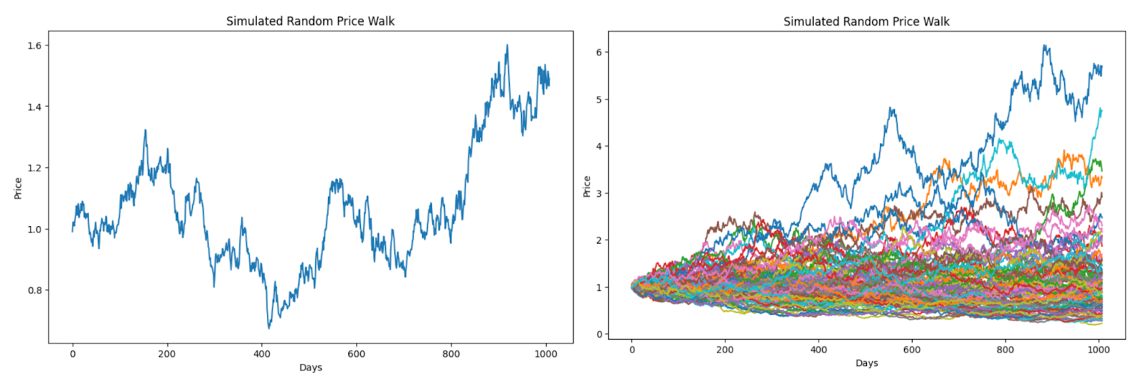
If you assume a daily volatility of 2%, approximately what Meta has averaged over the last few years, and a daily return of 0%, probably not realistic but useful for now, you end up with something like the plot at left. Running the simulation 100 times yields the plot at right. You’ll notice a huge range in possible outcomes. At best, the stock will be worth >5x the initial grant price after four years. You as will be rich! At worst, the stock craters to close to zero.
The stock market isn’t actually a random walk
However, over long periods of time, the stock market doesn’t actually behave as a random walk. It goes up! This is why people invest in the stock market. If I adjust the simulation to assume an average daily return of 0.1%, which is roughly Meta’s historical average, the figures look quite different (as expected).
Note: this “random walk” language is a reference to the famous book; a friend pointed out that what I describe above is still mathematically a random walk with μ > 0.

The embedded option
But you say, “how could you possibly know that Meta’s stock price will continue growing on average 0.1% daily?” You can’t. And if you could, you would just lever up all your assets and buy Meta stock and not bother to work. However, what you do have as an employee is an option. You can quit!
If you join a company with a four-year grant, something that looks like a four-year option comes free. I’ve never heard of a company firing an employee for making too much money due to stock appreciation, but employees quit all the time when stock price drops. This option is worth something (significant), but I’ve never heard people discussing how to quantify its value.
We can estimate the option value analytically using the Black–Scholes–Merton model (Merton is often forgotten, but we will recognize him here), which was published in 1973 to quantitatively price options based on similar assumptions we made above with our random walk. If we assume a 2% daily volatility, 0% discount rate, and 0% daily mean, a one-year European option on a $100 stock struck at $100 (this lets us calculate the value of optionality alone), should run $12.61 and a four-year $24.91.
This situation doesn’t perfectly mirror the RSU grant but should be eye opening. The optionality of a grant is worth (waving hands) 10%-25% of the actual grant value! And that option value is almost twice as large for a four-year vs. one-year grant.
But RSU grants really aren’t at-the-money options and Black-Scholes-Merton makes lots of assumptions that are reasonable for academics without powerful computers but not people who can run millions of simulations and don’t care about analytical elegance. We will calculate the real value of this optionality using a simulation.
The baseline
Let’s assume that you have two identical job offers from companies with the same historical (and estimated future) mean daily volatilities and returns. The first company offers four one-year grants and the second a four year grant. The scenario ignores refreshers (aside from the one-year grant refreshing every year) and assumes that you hold four years to make things simple.
At left is an example simulation that shows what happens to the price of the stock relative to its granted price over the course of 4 years (remember there are 252 trading days in a year) for both scenarios, assuming a 2% daily vol and 0% daily return. Notice that the employee ends up worse off with the 4-year grant because the third year resets the drawdown in year two. At right is a 100-run simulation. It is obvious where the price resets every year for the one-year option. Not surprisingly the variance of outcomes for the four-year are much greater. This is why it is valuable.

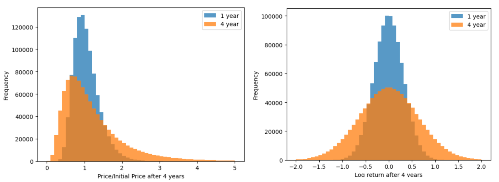
We can quantify the variance of outcomes by running the simulation one million times and computing the statistics of the value of the stock when the grant expires. You can see that the standard deviation of returns (left) and log returns (right) are much larger for the four-year than one-year grant. In fact, like the at-the-money option price predicted by BSM, the standard deviation of returns from the one-year grant is half that of the four-year grant (there is a square root term in the math behind this and sqr(4) = 2 = 2 x 1).
Note: you might be looking at the plot at left and wondering what is going on. If we sample daily returns from a normal distribution, why do we see a right skew with prices? Because returns compound exponentially over time to become prices, the distribution of prices given normally distributed returns is actually log-normal. When we take the log of the price distribution, we return to a normal distribution (right) that is usually easier to reason over.
This variance is worth something in and of itself, however, while in the short term, stock prices are reasonably accurately described as a random walk, over the long term, e.g. four years, they are not. There are many reasons for this: inflation, economic growth, increased productivity, and so on. These may or may not continue, but if you invest in the stock market like most people who read this blog, your revealed preference is that you believe these trends to continue.
If we rerun this simulation 1M times with a 0.1% rather than 0% mean daily return (approximately Meta’s historical average) and a 2% mean daily volatility, we end up with the plots below. Note that both distributions are pushed to the right, but the four-year distribution really benefited from those extra years of compounding. Lucky NIVIDIA employees are finding themselves in the extreme right end of the tail where their RSU grants may now be worth >10x of their initial value.

To contextualize these numbers, let’s assume that we have job offers from all of the companies below and that their stock prices will continue to behave as they have for the past few years. We simulate stock movements and report the maximum likelihood estimate (MLE), expected value (EV or mean), and median of the stock price at the end of the four years and the middle 50th percentile of the distribution (interquartile range or iqr).
Let’s walk through these numbers.
- Initial price: stock price when I started writing this doc
- 5-year mean daily return and volatility: the average daily return and standard deviation for each ticker over the last 5 years (or as long as available for companies that haven’t been public for 5 years). Note that the mean daily return is positive for Coinbase even though it trades below its IPO price. This is totally possible and stems from the compounding nature of these returns, which also explains the right tail of the log-normal price distribution.
- MLE (Maximum Likelihood or mode): Given these parameters and the assumption that price movements are approximated by geometric Brownian motion (GBM), this value is the most likely stock price.
- Expected value or mean: Given the same, if history were repeated many times, the stock would be on average this value. You can see that the long right tail of the log-normal distribution, driven by repeated, compounding lucky coin flips really drags the number higher. This number really starts to get at why the four-year grant is valuable.
- Median: Given the same, 50% of the time, the stock would be higher and 50% lower. This is the same as the daily return compounded over the number of days.
- IQR (Interquartile range): 50% of the outcomes are contained within this bound, however IQR is not centered on the mean. You can think of this like variance for a log-normal distribution.
| 4-year | 1-year | |||||||||
| Initial price | 5-year mean daily ret/vol | MLE | EV (mean) | Median | IQR/price | MLE | EV (mean) | Median | IQR/price | |
| GBM | $100 | 0/2.0 | $66 | $122 | $100 | 0.88 | $94 | $105 | $100 | 0.43 |
| Meta | $466 | 0.11/2.82 | $596 | $2109 | $1411 | 3.89 | $522 | $679 | $615 | 0.81 |
| $169 | 0.1/2.01 | $304 | $568 | $463 | 2.43 | $203 | $229 | $218 | 0.55 | |
| Microsoft | $425 | 0.11/1.92 | $884 | $1550 | $1287 | 3.02 | $527 | $587 | $560 | 0.55 |
| Coinbase | $243 | 0.12/5.6 | $39 | $3942 | $817 | 10.08 | $156 | $488 | $328 | 0.58 |
| Lyft | $12 | -0.03/4.53 | $1 | $25 | $9 | 1.6 | $7 | $14 | $11 | 0.91 |
| Coca-Cola | $67 | 0.04/1.31 | $86 | $109 | $100 | 0.85 | $72 | $76 | $74 | 0.31 |
What do you notice?
- After four years, the numbers get really big! For companies that have consistently grown, compounding a little bit every day adds up.
- Some of the numbers seem too big. We’ll return to this in the next section.
- Even companies whose stock price declined since IPO usually yield an EV higher than the starting price (and sometimes a median as well)
- The delta between four-year and one-year outcomes are enormous.
- There is a large difference between MLE, EV, and Median. Which one matters?
Digression: All models are wrong; some are useful
Before moving on, I want to briefly return to the size of the numbers in the table above. Is the median forecast for Meta stock really $1,411 in four years given historical returns? Didn’t Meta only double over the last four? Why would Meta triple in the next four?
The answer to this question lies in the simple GBM model we’ve built to forecast stock returns. It is commonly used in finance, but really doesn’t accurately capture the behavior of markets. The figure below 5 years of daily returns. Notice that they really aren’t normally distributed. You see huge outliers like +/- 25% days (what some would consider Black Swans based on their forecast probabilities (~10 sigma) but are actually quite common) yet most of the data cluster far closer to zero than would be captured by a normal distribution.
The fact that we sample from a distribution that does not accurately capture the data means that we inevitably will end up with unrealistic results. I suspect that our sampling fills in the space between the red line and the blue line, leading to a higher variance than in reality and that there is some skew that we are not capturing (notice more large down days than up days in the real data) that is leading to an unrealistic picture of the mean daily return.
You can see the latter in action with Coinbase. Despite trading below its IPO price, the stock actually clocks a positive mean daily return. This may seem counterintuitive, but it’s easy to understand with an example. Losing 20% two days in a row and then gaining 21% two days in a row yields you down 6.3% despite closing a positive mean daily return. This concept is generally known as volatility drag.
Some financial models use a Cauchy distribution, originally derived to help solve a number of physics problems, instead of a Normal distribution, which appears to capture the data better (below left), but I didn’t want to spend time on this. The point of this part of the post is that stonks generally go up and if you get a four-year grant, you will benefit.

Digression: Why not just sample from the historical returns?
Can we avoid the problem we identified by just sampling from the historical returns, i.e. the exact discrete distribution plotted in light blue above rather than a continuous approximation fit by a Gaussian or Cauchy distribution? We obviously can, but this doesn’t seem to be common in finance at all. If someone knows, please reach out and let me know.
I reran the above numbers for Meta and was a bit surprised by the results.
- Qualitatively (above right) the distribution of returns look very similar
- Quantitatively (table below) the actual distribution actually predicts an even more positive outcome (and still more optimistic than that same series of returns delivered over the past 5 years). I suspect that this is because daily returns are not actually random. When Meta’s market cap was pushed down to $300B, a 10% daily return would have required roughly $30B in buy orders. Today, $30B in buy orders would push the market cap up a small fraction of that.
- This is very curious to me because the Normal distribution doesn’t seem to fit the daily returns at all, but I guess a lot of smart people in finance have been doing this for a long time.
| 4-year | 1-year | |||||||||
| Initial price | 5-year mean daily ret/vol | MLE | EV (mean) | Median | IQR/price | MLE | EV (mean) | Median | IQR/price | |
| Meta (Normal) | $466 | 0.11/2.82 | $596 | $2109 | $1411 | 3.89 | $522 | $679 | $615 | 0.81 |
| Meta (actual) | $466 | N/A | $629 | $2390 | $1604 | 4.41 | $541 | $702 | $635 | 0.82 |
Digression: So which number gets you paid?
Maximum likelihood is conservative. You only get one run at a company and MLE is where you would most likely end up if you drew randomly and didn’t weight by outcomes. Notice that MLE for the 0% mean daily return case loses money. This is due to the concept of volatility drag that we previously mentioned.
EV is aggressive. The inverse of volatility drag is volatility lift. The EV of the distribution is highly influenced by lucky long runs of returns. If you were able to work a portfolio of jobs and achieve a reasonably high likelihood of hitting one of those lottery outcomes, optimizing for EV would make sense. However, most people can only work one job at a time, not thousands, and are not comfortable swinging for the fence.
The Missing Billionaires explained this elegantly with a simple coin flip experiment. If you have a 60/40 biased coin and $1M and want to maximize your wealth over 25 flips, how much do you bet with each flip? $400k would get you to an EV of $6.8M with a 41% probability of losing >50% of your wealth. $200k would only net an EV of $2.7M, but the chance of losing >50% of your wealth drops to 15%. This is why the EV of working at Coinbase is so much higher than the other companies. That vol can really pay!
However, the median (50th percentile) for betting $200k is $1.7M, much higher than $0.9M for $400k. If you are a normal person, you would probably be most comfortable optimizing for (and planning on) the median outcome. And as a bonus it is trivial to calculate without any modeling or sampling: (1 + estimated daily return)num_days. Estimating the mean daily return is of course impossible, but there is general agreement that stocks go up over time.
The point of this section isn’t to quantify exactly how much your stock will rise over the course of the grant, but rather to contextualize the model and point out another strong reason to push for a four-year grant beyond the optionality.
Wouldn’t it be cool to chop the left tail off the return profile?
Now we get to the crux of this post. What happens to the value of these grants when we include the optionality we described earlier, i.e. quitting. Below left, you see the distribution of prices when daily vol is 2% and daily return is 0%. Wouldn’t it be wonderful if there were one weird trick to chop off the left tail of the orange distribution to push all of your outcomes to the right?
It turns out there is. At right, you see a simulation similar to the one presented previously with one important difference: if the stock price decreases >30%, you quit and get a new, similar job and reset your grant price (max once per year). You still get the upside of the blue lines going up, but chop off almost all of the blue lines that drop below the green dashed line marking 70%.

This effect becomes even clearer if we run our simulations 1M times per company. Notice how we’ve totally lopped off the left tail of the distribution and the orange four-year distribution is above the blue one-year even for companies that have a negative daily return like Lyft. This is like free money.

The table below quantifies these distributions. Assuming that we continue treating the median price as the outcome to optimize, adding the quitting options boosts a 20% vol toy GBM company from 0% return over four years to 26%. This means that the grant is effectively 26% larger than the face value due to this optionality (probably not coincidentally approximately what BSM predicted).
The math works out even better for high-variance money losers like Lyft. Without quitting, you are likely to lose ~30% of your grant by the end of four years. With quitting, you are up 50%! This is the closest thing to free money you can imagine. While the difference is most striking with Lyft, this quitting effect boosting returns across all companies.
You might say, “I’m a loyal employee. I wouldn’t just quit my job on a whim.” The brilliant part of this is that you don’t have to. The mean quits/4 years are shown in the fourth column. For companies like Meta and Google, the chances of a 30% drawdown are really low (remember: all models are wrong) and you would only need to quit once every 9.3 years to achieve these results. For Lyft and Coinbase, this number drops to 2 and 3 years, respectively, but I suspect that those values are on par with their average tenure anyway.
| 4-year | 4-year quitting (30% drawdown) | ||||||||||
| Initial price | 5-year mean daily ret/vol | MLE | EV (mean) | Median | IQR/price | MLE | EV (mean) | Median | IQR/price | Mean quits/4y | |
| GBM | $100 | 0/2.0 | $66 | $122 | $100 | 0.88 | $100 | $149 | $126 | 0.73 | 0.83 |
| Meta | $466 | 0.11/2.82 | $596 | $2109 | $1411 | 3.89 | $466 | $2203 | $1558 | 3.89 | 0.43 |
| $169 | 0.1/2.01 | $304 | $568 | $463 | 2.43 | $169 | $581 | $479 | 2.39 | 0.16 | |
| Coinbase | $243 | 0.12/5.6 | $39 | $3942 | $817 | 3.02 | $243 | $4480 | $1165 | 11.71 | 1.32 |
| Lyft | $12 | -0.03/4.53 | $1 | $25 | $9 | 10.08 | $12 | $33 | $18 | 1.91 | 1.99 |
| Coca-Cola | $67 | 0.04/1.31 | $86 | $109 | $100 | 1.6 | $67 | $112 | $102 | 0.80 | 0.13 |
Note: with quitting the distribution is no longer log-normal, so the same statistics don’t apply.
Post-script: Refreshers stack on top of four-year grants
I’ve never worked at a company that awards one-year grants, but one really nice feature of four-year grants is they stack. If 50% of your comp is in stock and refresher grants are 25% of the initial grant, you get an automatic 12.5% raise each year for four years without any stock appreciation outside of any normal cost-of-living or merit increases. Outside of this system, I’ve never heard of such substantial guaranteed pay increases.
It’s possible that one-year grants naturally ratchet like this, but I doubt it. I suspect that they are granted alongside cash comp and used to target “normal” performance and cost-of-living-based increases.
Post-post-script: This blog post would not have been possible without Meta.ai
This blog post is a great example of something that would not have been worth doing without AI. While I wrote every word (I don’t think that any AIs write very well or maybe I am just particular about my style), Meta.ai generated all the figures and functions. I could certainly have written all of this code myself, but the labor of looking up BSM and translating to code or searching StackOverflow for how to add a horizontal green line to a figure would have been too annoying for me to bother with.
I suspect that it took me ~10 hours to research and write this blog post (not including many hours just thinking about how weird log-normal distributions are), but it would have taken me twice as long without Meta.ai. I think that this kind of preliminary research is the absolutely perfect use-case for AI.